Tesco ICONS
BBH, London
[03.24.196]
More Info
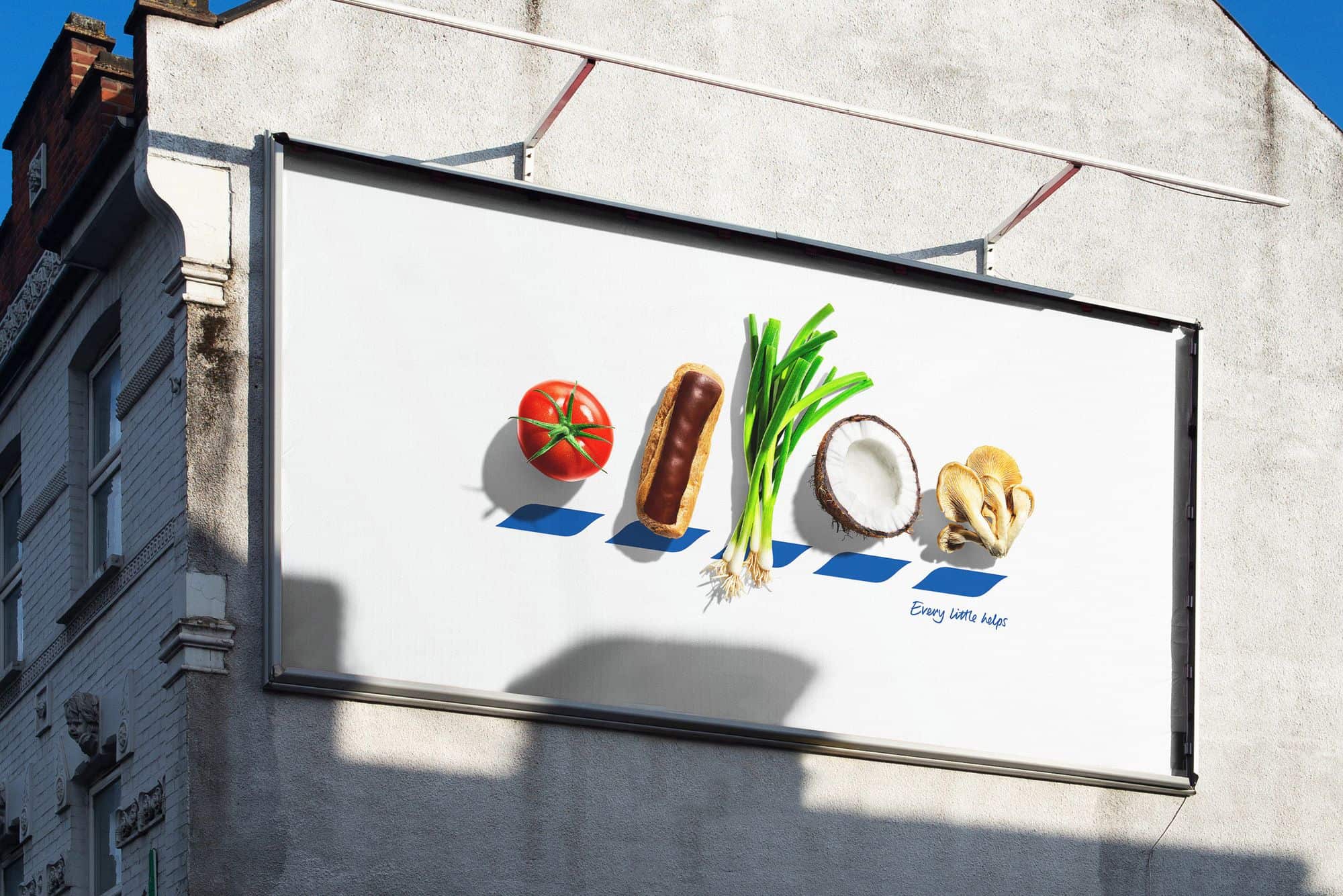
Tesco quite literally stands for quality food in a new OOH campaign by BBH London, which replaces the letters of its famous logo with beautiful fresh produce starting with T, E, S, C and O. Called “ICONS”, the campaign is BBH’s response to a brief to make Tesco stand for quality food.
Conventional marketing wisdom dictates that you should never alter your established brand logo. BBH recognised, however, that even stripped back to its five blue chevrons, the Tesco brand identity is still unmistakeable, and saw it as an opportunity to do something iconic.
Aimed at everyone who loves their food, from a beefy tomato to a crispy fried egg, “ICONS” uses beautiful photography by Will Cooper, who shot each item of produce with the same love and attention to detail that Tesco pays to sourcing it. And by replacing the letters of TESCO with food, the posters give passersby a playful puzzle to work out and truly let the food do the talking.
- Client Tesco
- Ad Agency BBH, London
- Creative Director Felipe Serradourada Guimaraes
- Art Director Luke Till
- Copywriter Lawrence Bushell
More: BBH London
Lurzer’s Archive
Log In1/ 0
Images
Tesco ICONS
Your cart is empty
Put the world's most renowned curated archive at your fingertips
Unlock full 24/7 online access to over 40 years of groundbreaking creativity. Enjoy unlimited searches, exclusive digital content with special reports and insights, interviews with global creative leaders, and priority access to newly selected work in the Archive. Stay inspired, wherever you are.


